Data Visualization

This guide helps you understand how data visualization can enhance data analysis and facilitate faster, more effective decision making.

A collage of various data visualizations and charts is displayed against a dark blue background. The visualizations include graphs, plots, and diagrams, arranged in an irregular grid pattern. Photo credit: Kostiantyn Kucher and Andreas Kerren.

What is Data Visualization?

Benefits of Data Visualization

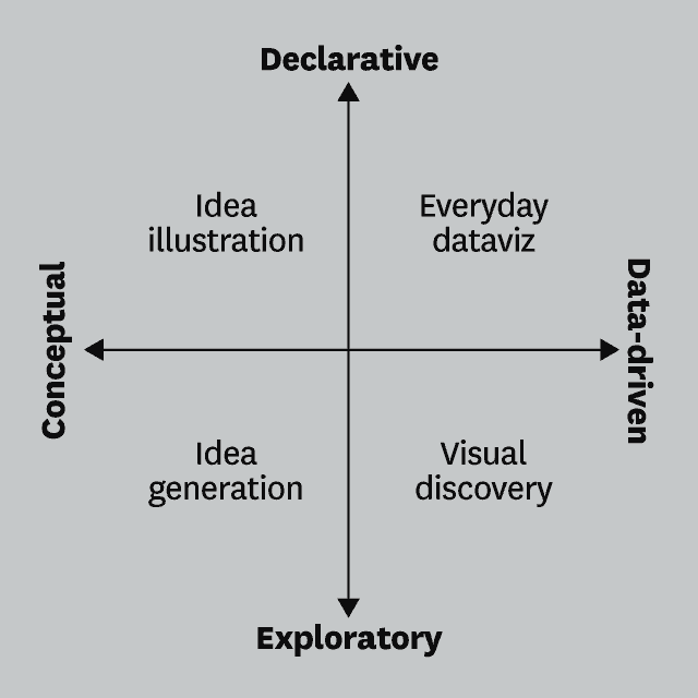
Visualizing data is more than transforming it into bar graphs and pie charts. When you choose the right interactive data visualization to highlight the most important aspects of your data, you can illuminate new insights and communicate them more persuasively. And that data storytelling can result in smarter actions and bigger outcomes for your business.

Sankey diagram showing sales distribution by category and country, with babywear leading in Germany and women's wear leading in the USA, UK, France, and Brazil.

  1. Faster decision-making: By viewing and manipulating big data in visual and animation formats, you can understand the story your data tells you at a quick glance, rather than poring over piles of numbers and tables for hours or weeks.

  2. More data exploration: The best tools allow you to interact with all your data, directly on the chart to discover hidden patterns, see data relationships and uncover actionable insights — all without IT support.

  3. Better track business initiatives: Dashboards help you easily track the performance of business initiatives by allowing you to quickly see how everyday operations affect key performance indicators (KPIs).

  4. Extend your analytics investment: Because visuals make it easier to understand data, everyone in an organization — including business users — can explore data and find insights that improve company growth and effectiveness.

Types of Data Visualization

Form follows function. In other words, before you choose a visualization type, ask yourself, what is the function of your chart? What relationships in your data do you want to show?

Here we describe and give examples for 9 functions of visualizations and the corresponding chart types for each.

Change Over Time

Chart types:

Screenshot of a Qlik Sense dashboard showing change over time charts and graphs

Distribution

The function of distribution charts is to show how data is spread across a group. This helps you spot outliers and commonalities, as well as see the shape of your data. For example, public policy officials might want to see the demographic or income characteristics of a certain population.

Chart types:

Screenshot of a Qlik Sense dashboard showing distribution charts and graphs

Part-to-Whole

This category of charts is best for showing how a single KPIs or metrics can be broken down into component parts. A good example would be if a marketing leader wanted to see all new leads broken out by their source.

Chart types:

Screenshot of a Qlik Sense dashboard showing part-to-whole charts

Correlation

The function of correlation charts is to convey relationships between variables. Some charts, like a bubble chart, can represent three dimensions of data, where the size of the bubble is the third value on top of the XY axis values. For example, an executive could see in one chart how sales volume and profit are correlated by country.

Chart types:

Screenshot of a Qlik Sense dashboard showing correlation charts

Flow/Movement

The function here is to show movement data or the flow of data between conditions. For example, in data science, flow maps show how something like migration happens from one location to another.

Chart types:

  • Chord

  • Network

  • Sankey

  • Waterfall

Screen shot of a Qlik Sense dashboard showing flow graphs

Ranking

The function for ranking charts is to show how a list of data points relate to each other. For example, a bar chart in descending order would highlight which salesperson is driving the most sales.

Chart types:

Screenshot of a Qlik Sense dashboard showing ranking charts

Deviation

The function here is to highlight variation of data points from a given baseline. For example, a finance leader might want to visualize an organization’s budget surplus vs deficit.

Chart types:

  • Bar Diverging

  • Bar Diverging Stacked

  • Line Surplus/Deficit Filled

  • Spine Chart

Screenshot of a Qlik Sense dashboard showing deviation charts

Magnitude

The function of magnitude charts is to convey relative or absolute comparisons in quantity. An example would be if an executive wanted to compare domestic vs international revenues.

Chart types:

Screenshot of a Qlik Sense dashboard showing magnitude charts

Spatial

Spatial, or geospatial, charts serve the function of communicating geographical locations and patterns in data. For example, police might want to evaluate crime statistics in different parts of a city.

Chart types:

Screenshot of a Qlik Sense dashboards showing spatial charts

Best Practices for Data Visualization

As we stated above, first consider the function of your chart. The Harvard Business Review helps frame this question, suggesting that you determine whether your goal is to declare or explore information and whether this information is conceptual or data-driven.

Using these two parameters as axes, we get the 2x2 matrix below, showing the four main purposes for your visual communication: idea illustration, everyday dataviz, visual discovery, and idea generation.

A two-axis graph with 'Conceptual' to 'Data-driven' on the horizontal axis and 'Declarative' to 'Exploratory' on the vertical axis. Four quadrants are labeled Idea illustration, Everyday dataviz, Idea generation, and Visual discovery.Image credit: Harvard Business Review

/

  • Product Terms
  • Legal Policies
  • Privacy & Cookie Notice
  • Terms of Use
  • Trademarks
  • Do not Share my info
  • © 1993-2025 QlikTech International AB, All Rights Reserved

    English
    -->